Images supplied by asbCreative Photography.
Just how does the overall presentation of a wine influence purchases?
Winemaker and writer Paul Le Lacheur spoke to leading industry designers to find out how consumer perceptions and sales are shaped by packaging design.
It seems that for winemakers there is an almost infinite variety of bottle sizes, shapes, colours and label size parameters from which to choose. Recently, a number of wine industry design personnel were asked whether these issues make a discernible, or justifiable, difference to the bottom line, and the answer was a resounding ‘yes’.
Scott Lawless is sales manager at Studio Labels and Cork Supplies in Adelaide. His answer on whether bottle design matters was an unequivocal ‘certainly’.
“For the vast majority of wine consumers, the level of understanding is minimal because they don’t have a high ‘care factor’ at purchase. That doesn’t mean they aren’t influenced by a quality bottle to expect quality contents,” he explained.
Lawless explained how some more ‘highly-involved’ consumers reacted when tasting wine from a heavy weight 1.2kg prestige bottle. As an expensive choice (at $3.20 per bottle), this doesn’t rest lightly with winery decision-makers.
“Their responses were at the more obviously ‘conscious’ level. Several people responded: ‘it’s normal to have such a high expectation of quality’. The square-shouldered Bordeaux bottle said ‘expensive’. Packaging cues predicted both high quality and age worthiness, especially for unusually shaped bottles. It was obvious to me that their perceptions were led by bottle shape” he hypothesised.
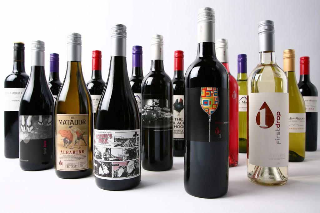
It isn’t just a matter of bottle shape influencing quality perception: it relates to wine style quite directly. Research in Canada reflects this idea. A group of wine consumers was asked to comment on two identical wines decanted from one bottle into two. Respondents indicated the square-shouldered (Bordeaux) bottle was ‘big, firm and full-bodied wine with high tannin levels’. In contrast, a round-shouldered (Burgundy) bottle produced ‘soft, smooth, low tannin’ comments. Wicker flasks encased in straw (Chianti bottle) precipitated ‘medium-bodied Sangiovese with fairly firm tannin’ reactions.
When asked if wine customers are concerned about the carbon footprint or ‘food miles effect’ of wine packaging decisions, graphic designer Serg Jeloscek from Design Core said some producers say they want as small a carbon footprint as is achievable for their product.
“Lightweight bottles are a big part of their production choices,” he enthused, although he reflected that for some wineries, “it’s a marketing ploy used without any strong environmental conviction”.
It appears that wine consumers may not be as heavily invested as some wine producers in that they aren’t demanding low carbon footprint bottle changes.
In conversation with Jeremy Boyd, a freelance label designer with loads of experience, some great insights were shared into packaging design.
“There is an extremely strong correlation between label design and how a wine product is received by consumers. I hear from winemakers who say ‘my distributor told me my labels need improving to help sell more product,” he explained.
“The overall presentation of a wine greatly influences purchases and is very contextual. If a wine is intended to quaff at home, then label design may not be so important, but when purchased for a specific occasion, packaging design becomes of utmost importance.
Wine packaging sets a tone that says as much about the purchaser as the product itself.”
Labels for different occasions
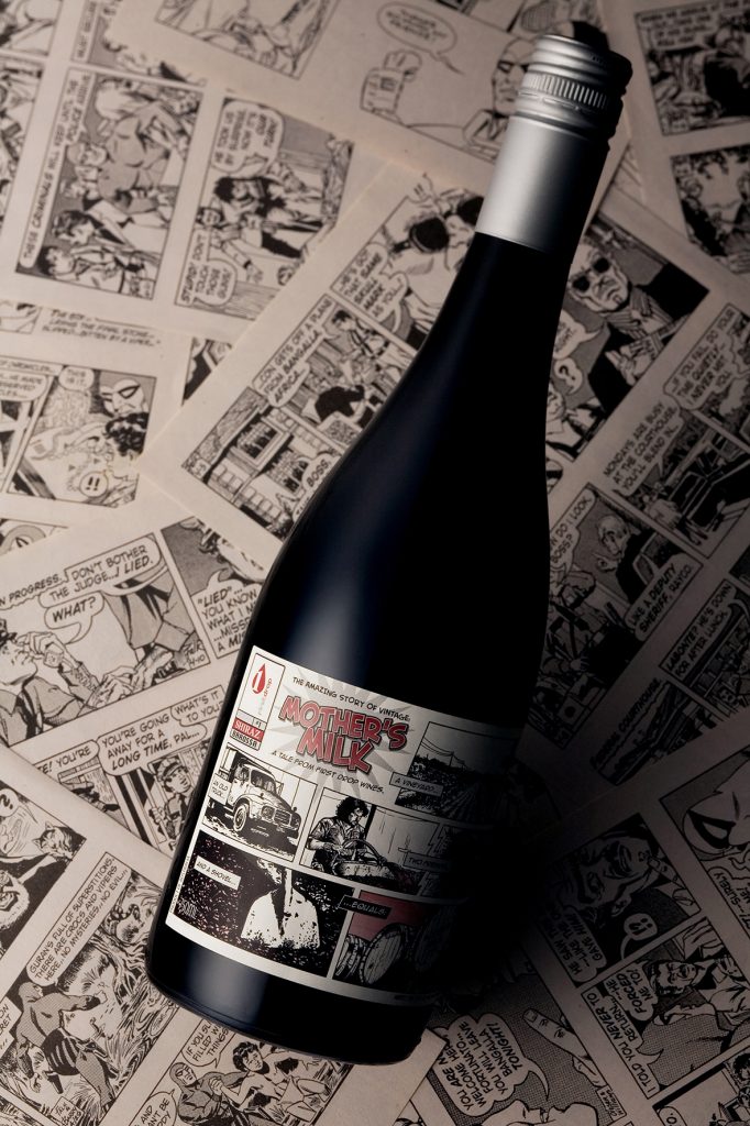
“Consider how people purchase different labels for different occasions. A premium label for a gift to impress, a fun and hip label that will get attention at a party, or an intriguing label that will spark dinner table conversation. How many times have we heard someone say at dinner say, ‘I haven’t tried this one before, but I liked the look of the label’?
“An interesting label can nudge a consumer to pick a new bottle off the shelf. Providing the wine is to their taste, they may end up becoming a long-term repeat customer,” he added.
“A combination of visual, emotional and aesthetic cues come into play when wine is selected for purchase. Firstly, the label has to look the part. Questions we unconsciously ask ourselves at the point of purchase are things such as, ‘does it look like good value and high quality for the price point?’; ‘does it reflect my own personal style?’, or, ‘will it impress those I will be sharing it with?’
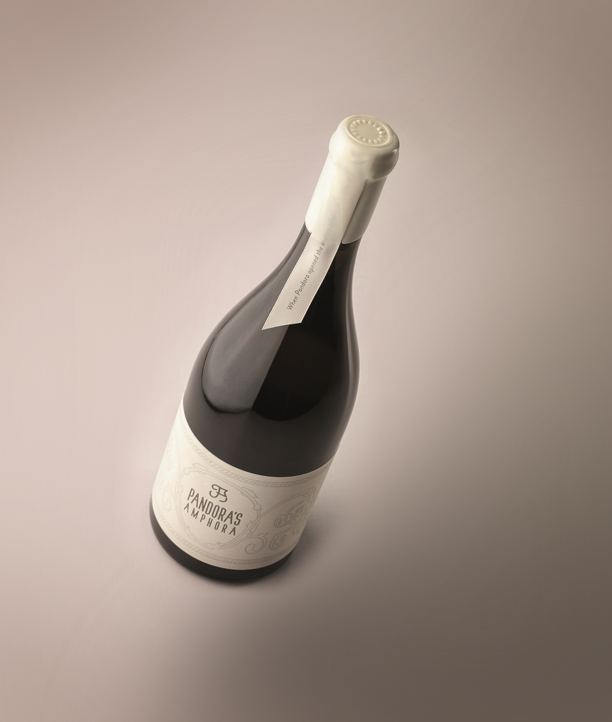
“Time tested visual cues such as gold foil and cursive fonts can instil a sense of tradition and quality. Custom embellishments such as wax seals or printed ribbons may suggest something truly special, whereas bright artistic illustrations may suggest a fun wine made for drinking with friends. We look to packaging cues to gain a sense of what’s inside the bottle as well as what occasion it may best suit. Our perception of these visual cues triggers emotional responses – something that varies from person to person depending on our past experiences and views of the world. Some may emotionally interpret a label design as rare or premium, others may interpret the same label as dull and uninspiring. This is why it’s so important to have a clear focus on a defined target market for your product and to design the aesthetics of your packaging to appeal to them specifically. Label design acts as a bridge connecting winemakers and consumers,” confided Boyd.
“Custom glass bottles are a great way to project the uniqueness of a brand, though some label designs are simply not suited to certain bottle shapes or glass packaging. Paper labels generally require a completely flat surface for proper adhesion to avoid creasing, bubbling or lifting. Premium and custom glass bottles often have a reduced flat surface area, requiring designers to get creative with label size and shape.”
A key question Boyd asks his winery clients is: ‘What are you hoping to achieve?’
“Surprisingly, the answer may not always be to sell more wine. The winemaker may be wanting to shift existing market perceptions or build a specific reputation. Exploring this simple question in designing a package to fit the desired outcome creates winning results. The more a designer knows about a client’s business, brand, customers and competitors, the better. Deep insights lead to unique solutions and positive outcomes,” he affirmed.
As to which comes first in the marketing design mix: bottle or label, Boyd revealed that this depends on the winery customer, and where they are in their winemaking process.
“Often a wine will already be bottled and sitting as cleanskins by the time I’m approached to assist. Here, bottle shape is already decided, so the label is designed to suit. Other times I have a blank slate and an open brief before bottling, allowing the glass to be factored in as part of the overall design. This is the ideal situation. It allows all elements of the packaging to be considered as a unified whole. It creates a truly unique expression of the brand.
“Both glass and label design play an important role in shaping consumer perceptions and selling wine. People like to think their decisions aren’t affected by labels, but they are highly influenced by the psychology of packaging design. If done right, customers will pick up and try a new wine just because ‘I liked the look of the label’,” added Boyd.
Jeremy DV Boyd is a professional freelance graphic designer with 25 years’ experience. He specialises in branding, wine packaging and promotional material for print and online. More information about his work can be found online: www.jeremydvboyd.com or instagram.com/boydsta